In Part 1 of this post, I covered what I learned from art professor Heidi Goldberg about bookbinding. In this post, I’ll discuss what she taught me about printmaking.
Modern printing is mostly done by machines, but there are still people who know a great deal about traditional printmaking, and Heidi is one of them. The text I printed with her was much shorter than a Chaucerian tome, but otherwise the process we used is fairly similar to the one used by the printers of the Urry edition.
We began by choosing a font – each available font has its letters and symbols laid out in a case like this:
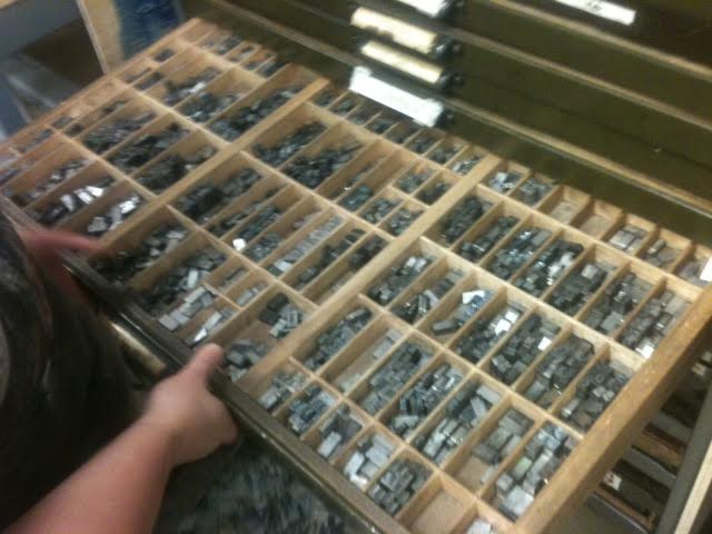 Interestingly, the uppercase letters (on the right side of the case) are mostly kept in alphabetical order, with two exceptions: the newest letters to our alphabet, J and U, are placed after Z.
After we assembled our text, we placed it on the printing press and set a frame around it. We then used metal and wood blocks to hold the text in place within the frame:
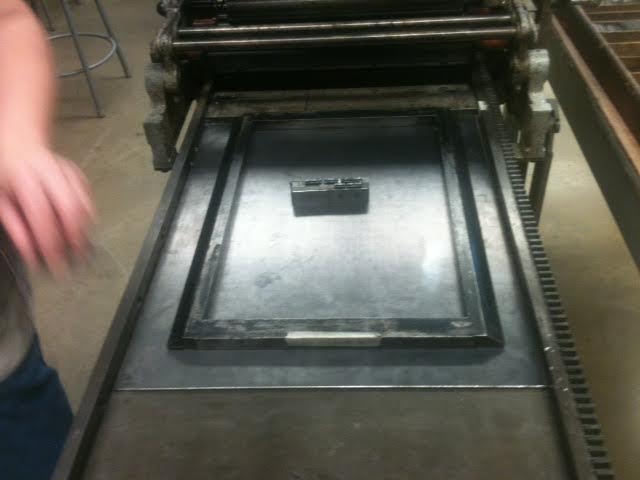
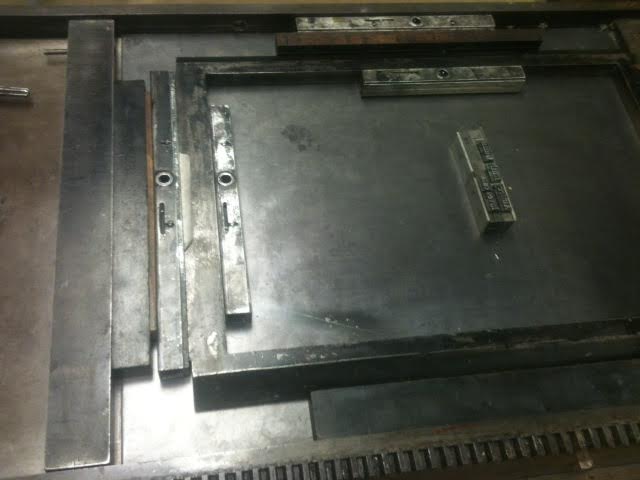
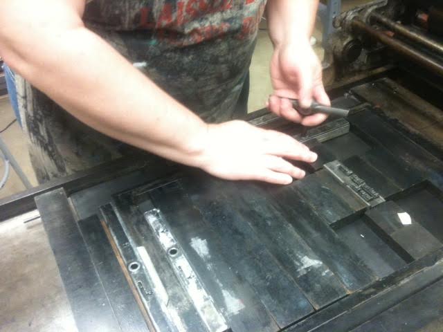
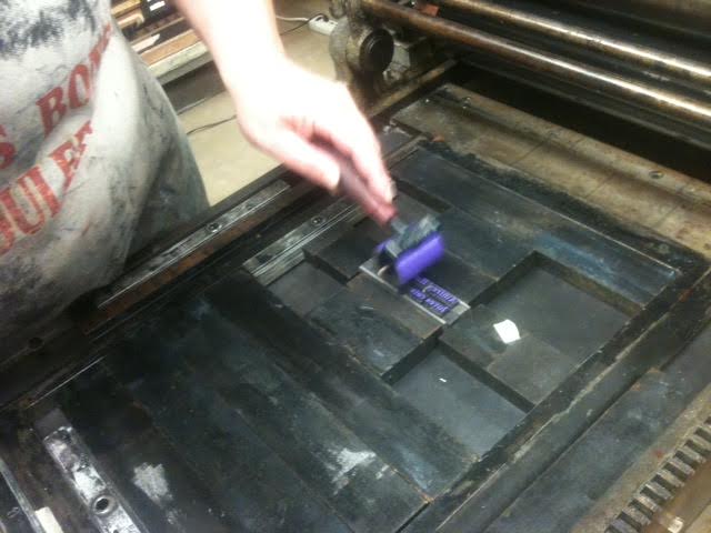
Next, I chose my favorite color, and we painted ink onto the type. (Okay, Urry’s printers didn’t use purple, but I did!)
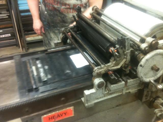
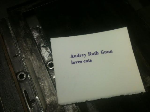
 Finally, we added a sheet of paper, and ran it through the press to print!
Thank you again to the wonderful Heidi Goldberg for teaching me so much about bookbinding and printmaking. I have a much better understanding now of this long and complicated process – no wonder books were still so expensive in Urry’s time!
